InSync
Developing a cohesive brand identity, illustration design theme and user experience for a corporate wellbeing platform.
Developing a cohesive brand identity, illustration design theme and user experience for a corporate wellbeing platform.
Introduction
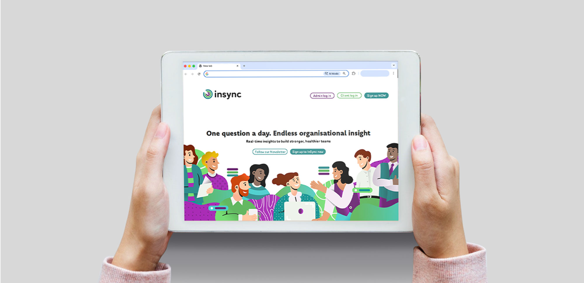
I recently collaborated with Durham University and the developers of a web platform called InSync to create a cohesive brand identity and apply it across the website’s user interface and overall user journey. The project involved translating complex, data driven insights into a clear, approachable, and trustworthy visual experience.
The Brief
InSync is a corporate health measurement platform that gathers data from a range of organisational parameters, including remote working, profitability, employee benefits, and other key factors, to assess how these elements impact overall employee happiness and wellbeing.
The team approached me for freelance graphic design support to develop and establish a complete brand identity. This included logo design, colour palette, iconography, and an illustration style that would clearly reflect the platform’s purpose while delivering an intuitive and engaging user experience. The core brand values were simplicity, innovation, and trust.
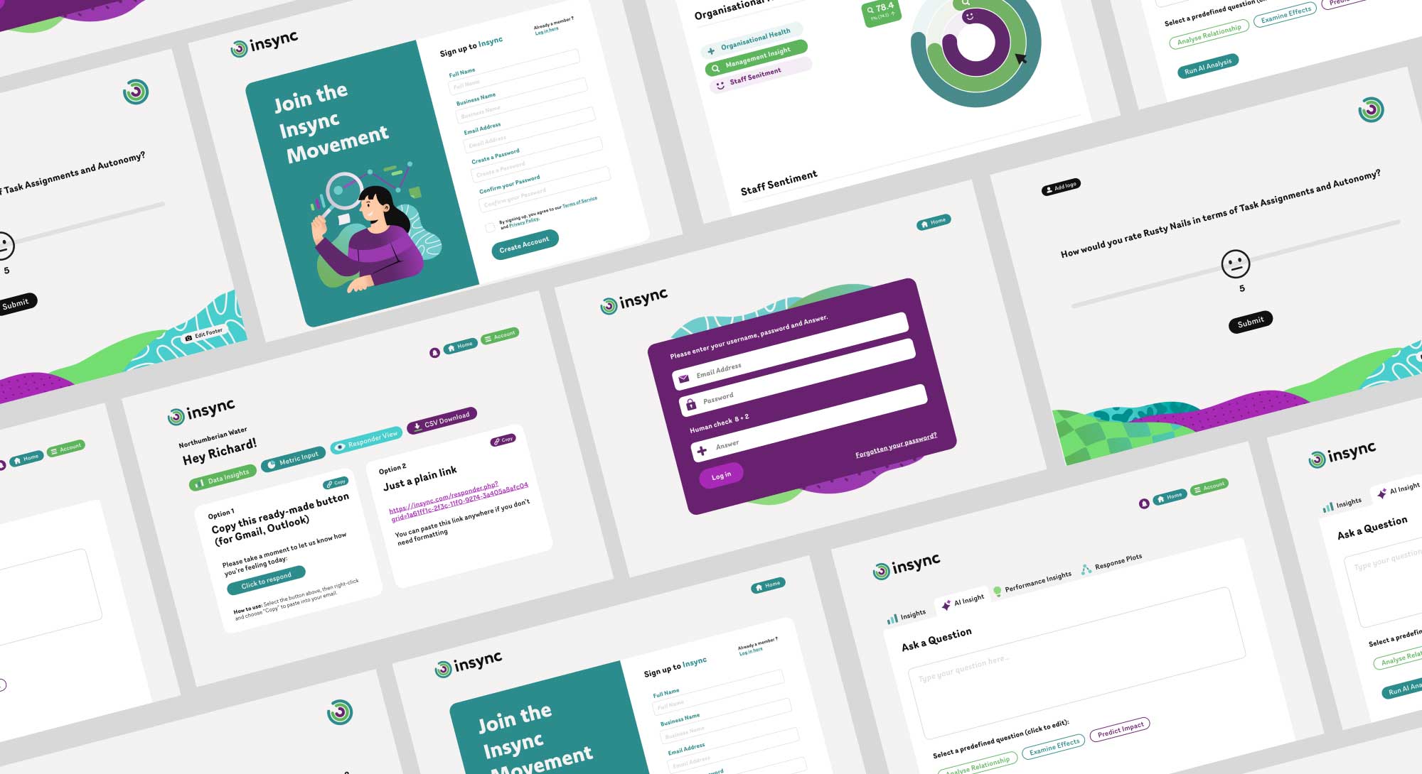
Once the brand identity was established, I worked closely with a web developer to design a user interface that was easy to navigate and consistently reflected the new visual language across the platform.
The Process
The project began with the development of the logo and brand toolkit. I explored several conceptual directions before aligning with the client on a minimal logo design inspired by a circular chart, a prominent and recurring feature within the platform’s data visualisation. This approach ensured the logo felt directly connected to the product. Alongside this, I developed the colour palette, iconography, and illustration style, presenting multiple options before selecting a playful motif based approach that added warmth and approachability to the brand.
With the visual language established, I worked closely with the web developer to apply the brand consistently across the platform. User interface icons were kept minimal, while larger explanatory illustrations were used to support key user touchpoints, particularly on the homepage. Through iteration and feedback, the final user interface delivered a clear and intuitive user journey that balanced simplicity, innovation, and trust, resulting in a cohesive and engaging platform experience.